
Toshi Omagari: Arcade Game Typography
Ein Buch über Fonts in Pixel Games, die in Fleißarbeit und mit Nerd-Liebe aus Screenshots extrahiert und vervollständigt wurden. Was für eine wunderbare Idee von ‚Typeface Designer‘ Toshi Omagari aus UK.
22.10.2019
Wenn ihr also auf alte Videogames steht und dazu rein zufällig auch noch zu den Font-Geeks da draussen gehört (vermutlich findet sich hier auf dem Blog eine gewisse Schnittmenge ;)) , dann ist dies euer Buch.
Unten sind Bilder der Hardcover-Version, die es hier zu erwerben gibt (limited to 1000). Auf Amazon (Affiliate Link) findet ihr die ebenfalls sehr schicke Paperback Variante, die ich mir gleich geordert habe.
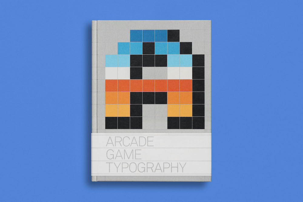
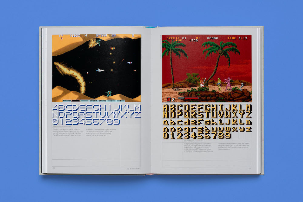
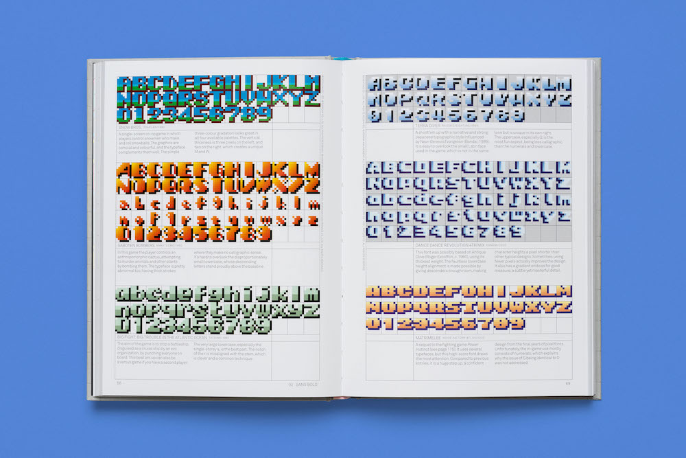
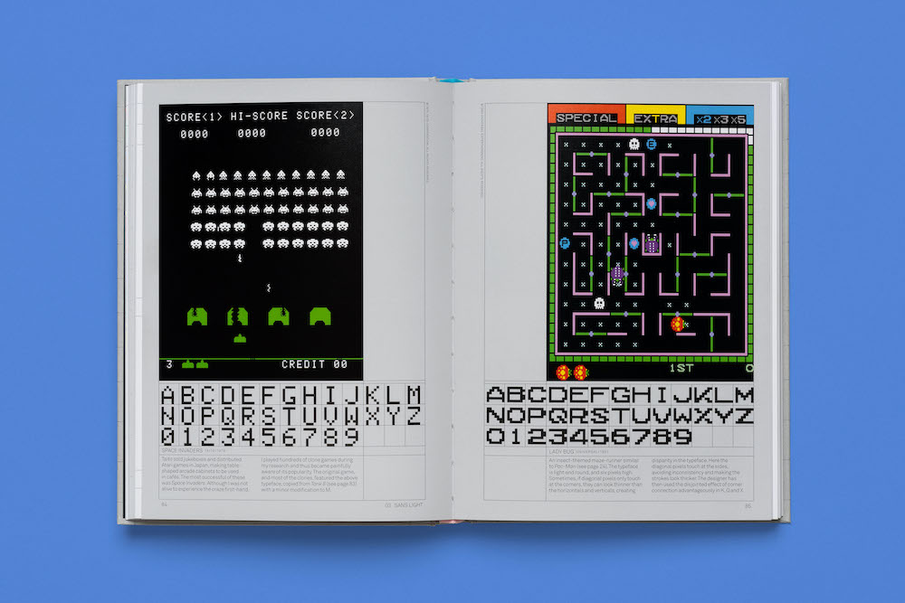
The first book of its kind – a definitive and beautifully designed survey of ’70s, ’80s and early ’90s arcade game pixel typography. Exhaustively researched by author Toshi Omagari (a celebrated typeface designer at Monotype UK) Arcade Game Typography gathers together 250 pixel typefaces, all carefully chosen, extracted, redrawn and categorised by style, and each with an accompanying commentary by Omagari. The title also features 4 illustrated essays on videogame typography theory and practice, documenting the unique advantages and challenges presented to designers of these bold, playful and often quirky alphabets.
A beautifully produced celebration of the eclectic typography featured in hit games such as Super Sprint, Pac-Man, After Burner, Marble Madness, Shinobi, as well as countless lesser-known gems. Unlike print typefaces, pixel type often has colour ‘baked in’ to its characters, so Arcade Game Typography looks unlike any other typography book, fizzing with life and colour.
(via)
*** Belong to the cool Kids! It’s Easy: Follow this Blog on Social Media like Twitter, Snapchat or Instagram for more Content of from Zwentner.com & about my Life ***